A 750-year-old book, redesigned for the phone in your pocket.
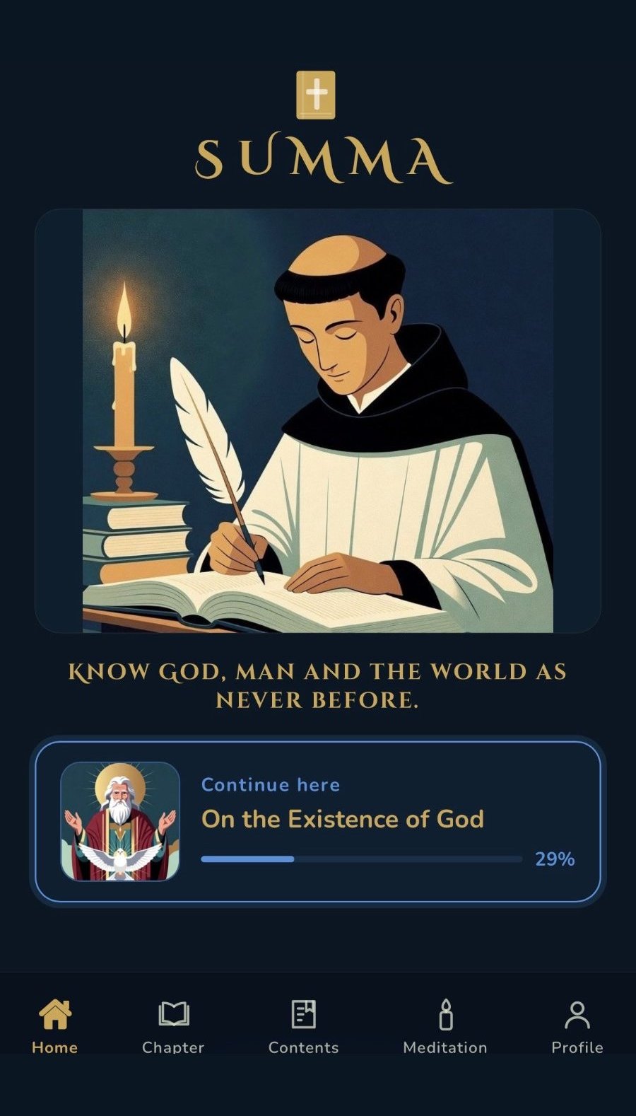
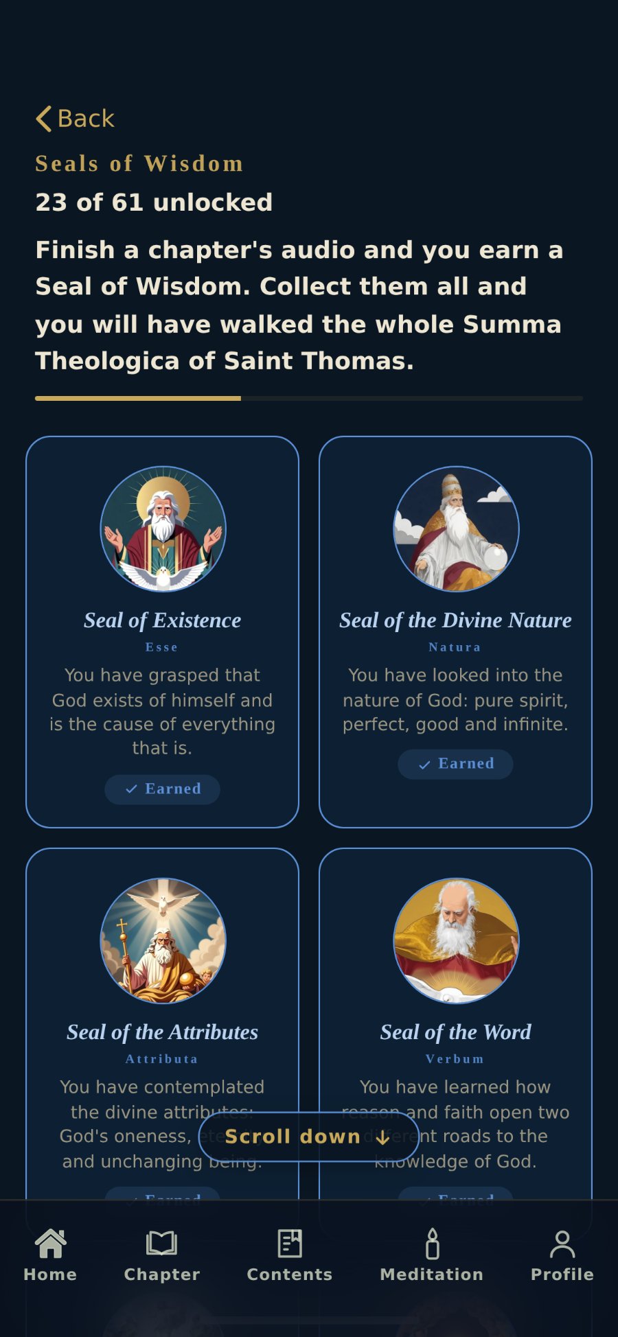
Summa is a reading and listening app built on short exchanges of question and answer. Each chapter takes a few minutes, can be read or heard, and earns a seal when you finish it. Four guided meditations bring it into everyday life. It opens from a link on any phone, in English or Spanish, with no account and nothing to install. I designed and built it end to end: the interface, the type and colour system, the illustration direction and the listening experience.
An app people would actually finish.
Most apps built on a serious text make one of two mistakes: a wall of text, or trivia. Summa had to avoid both.
It is for anyone with a real question and a few spare minutes: a commuter, a catechist between classes, a parishioner who has never opened the Summa. So each chapter had to fit one short sitting, work on a phone in either language, be heard when it couldn't be read, and show the reader how far they had come.
The design problem: make a serious body of work feel finishable, without making it trivial.
Four decisions that shaped everything else.
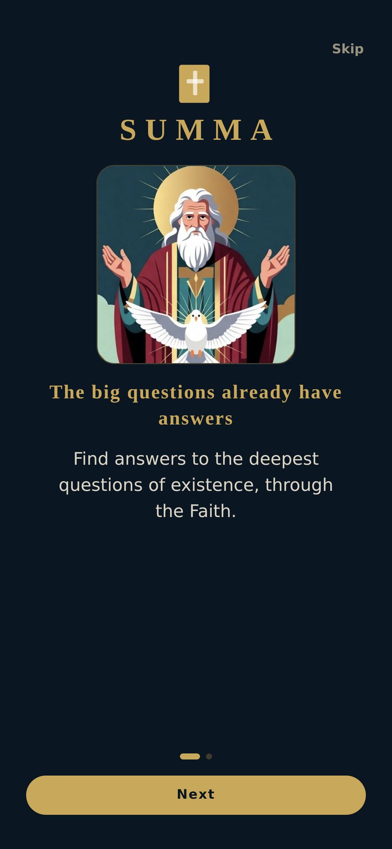
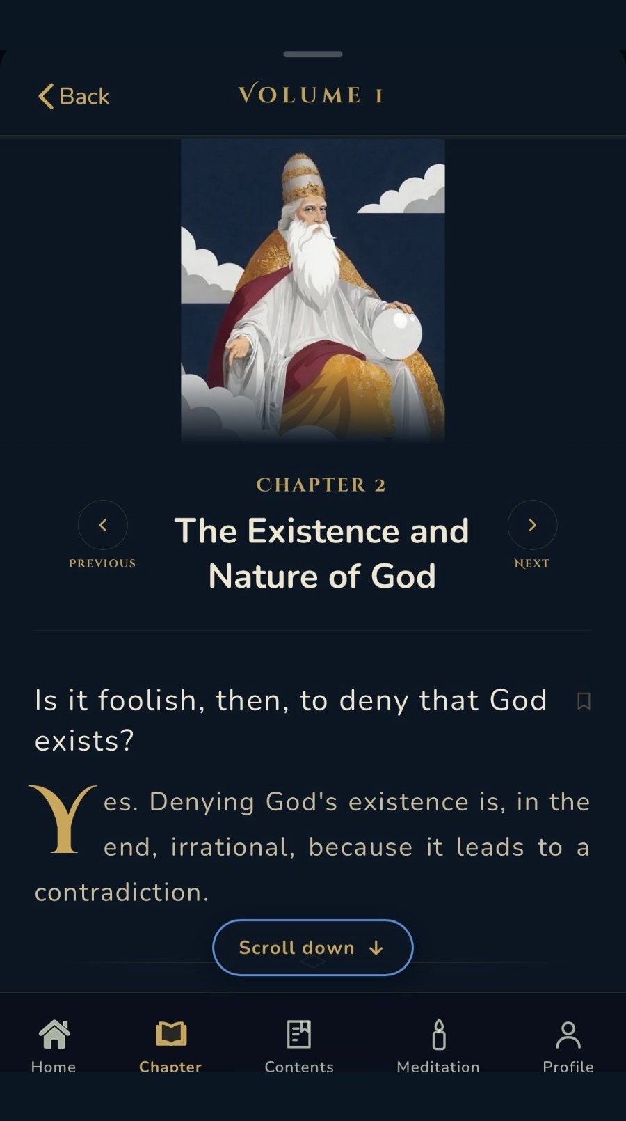
Aquinas already wrote in short questions and answers. One pair per screen, rather than prose the reader has to break up themselves.
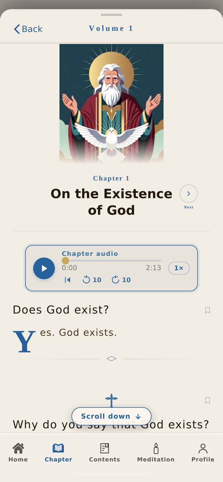
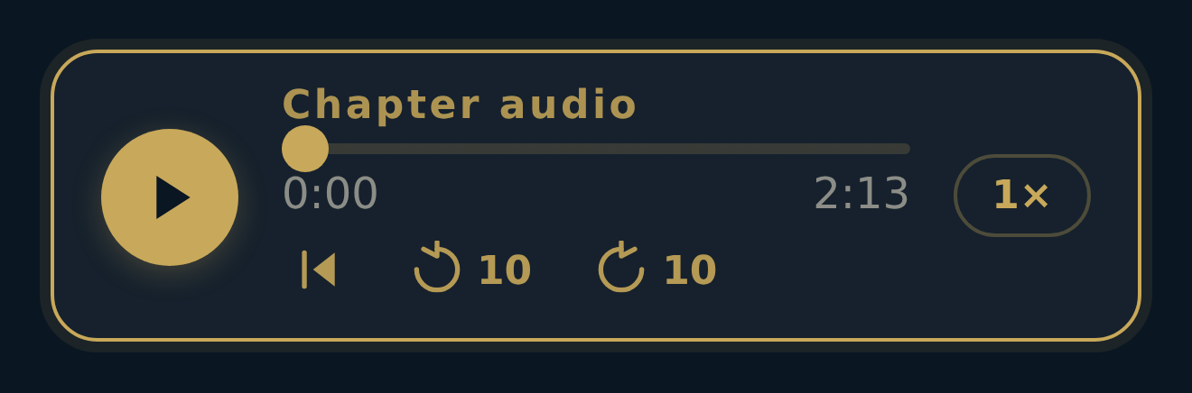
The same text, read or played. The player sits inside the chapter, not in a separate section, so listening is never a detour.
A seal is earned when a chapter's narration ends, not when it starts. Progress means something because it costs something.
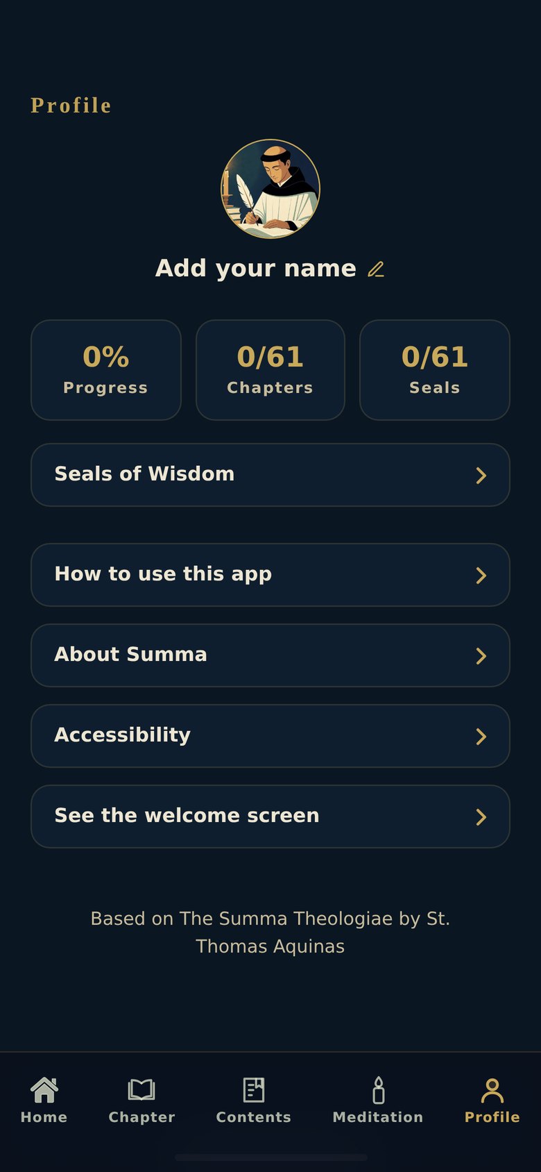
Progress lives on the device. Nothing to sign up for, nothing collected, and the language switches mid-chapter without losing your place.
Knowing where you are in a work this size.
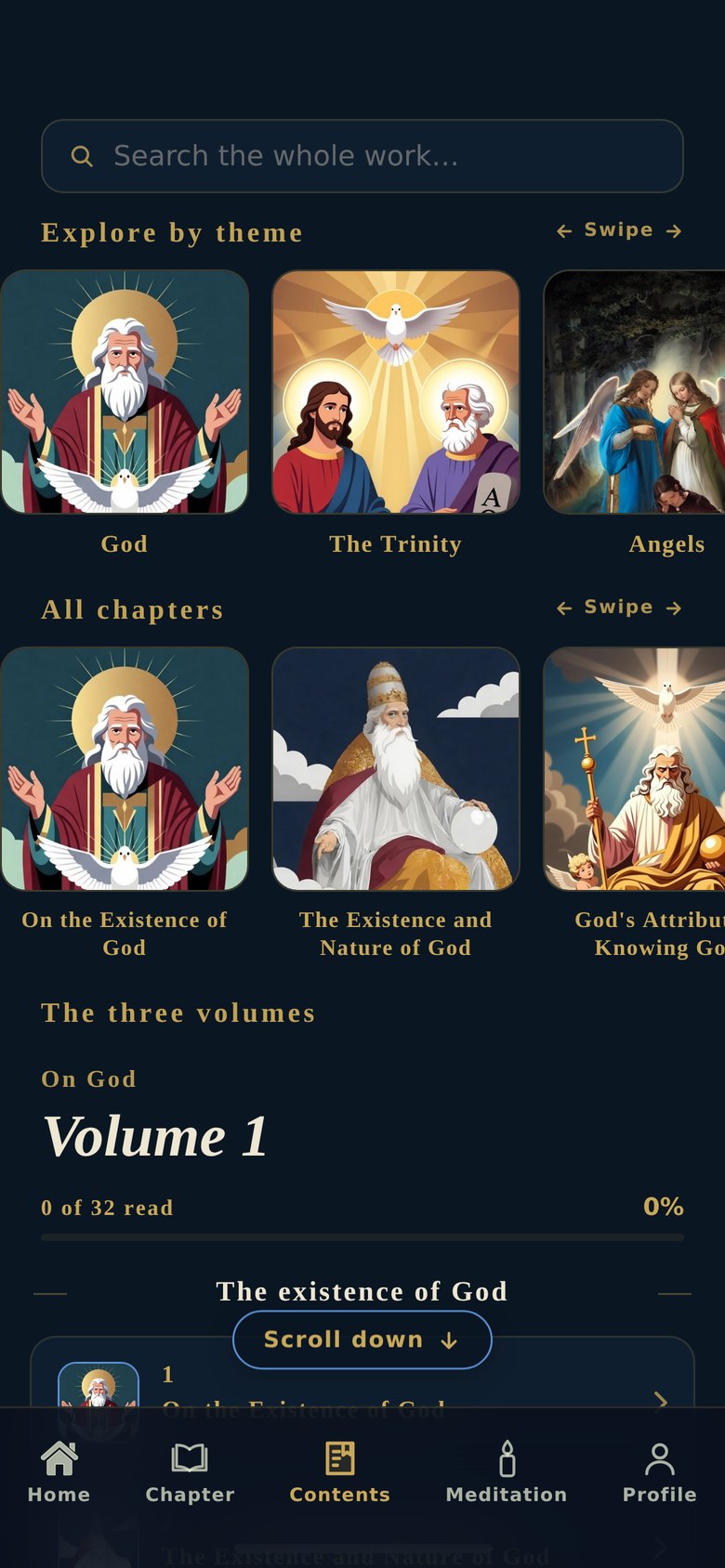
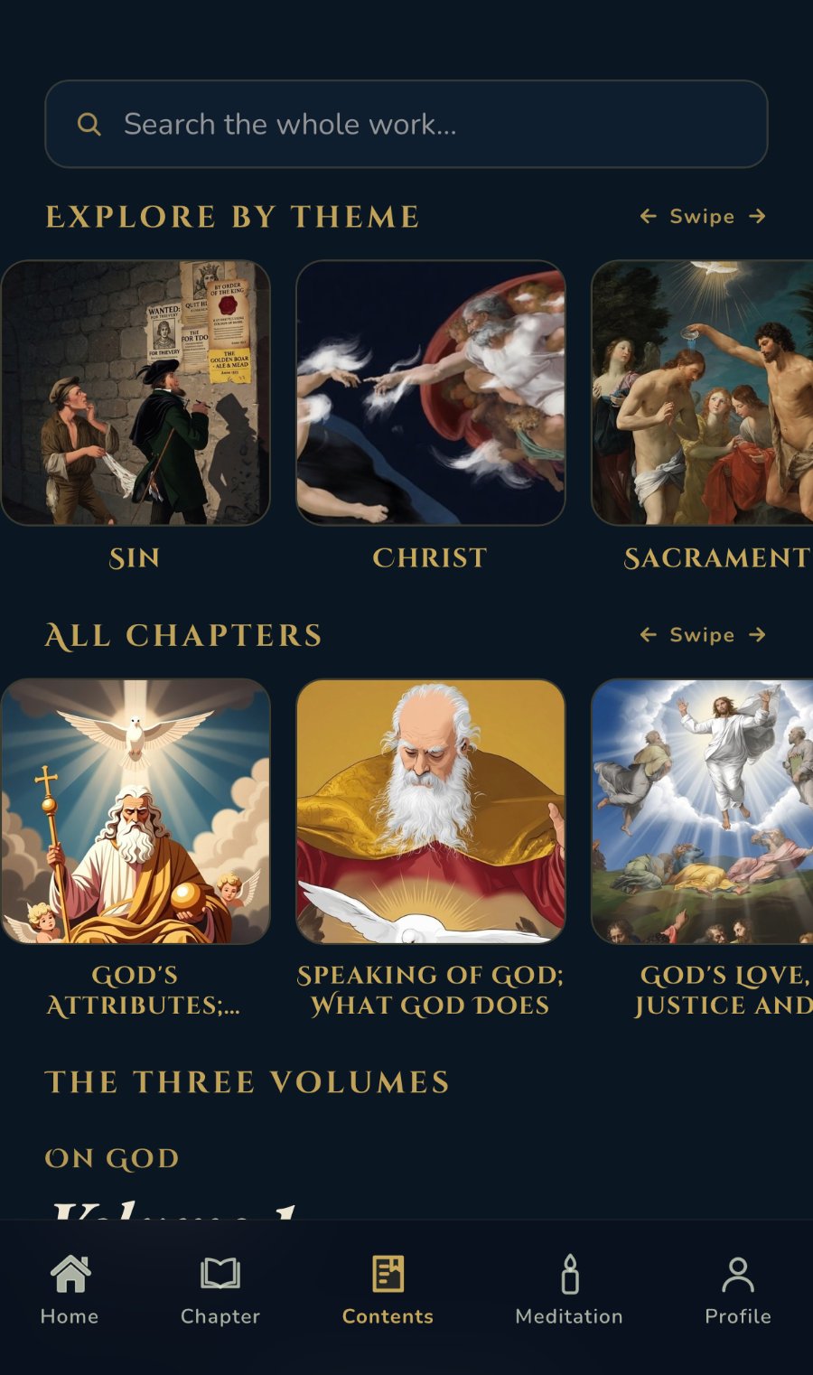
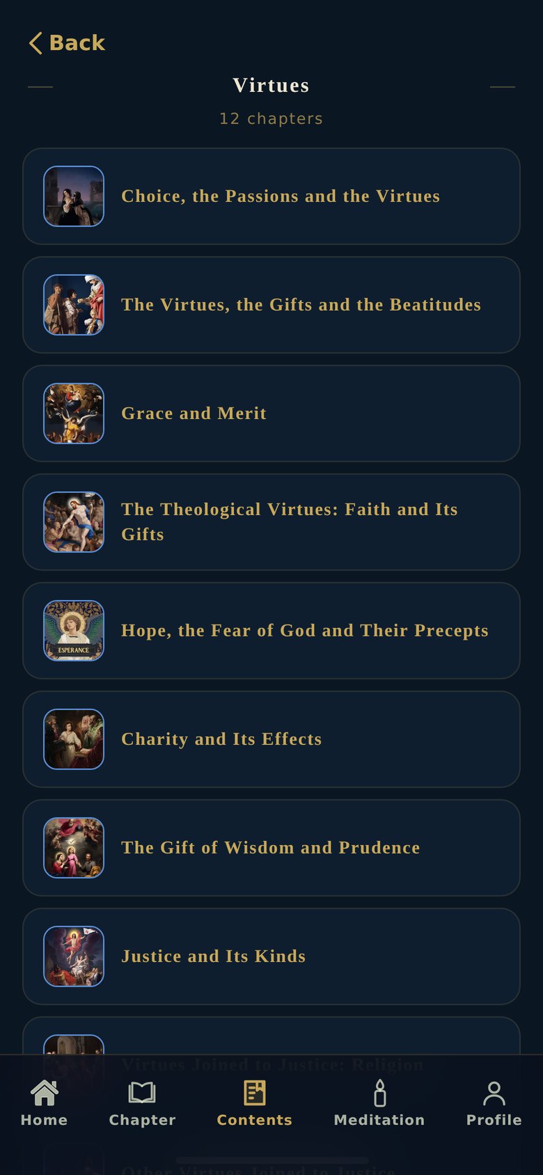
Sixty-one chapters is a lot to face at once. Contents offers the same body of work three ways: by theme for the curious, by volume for the systematic, by search for anyone with a question already in mind. No reader is forced through the front door.
EARNED, NOT OPENED
A seal arrives when a chapter's narration finishes, five seconds before the end, while you are still listening. Tying it to completion rather than to opening is what keeps it from becoming a badge.
A FIXED TOTAL
Every seal is visible from the start, earned or not. Progress reads against sixty-one, not against an open-ended list, so finishing is a real horizon, not a receding one.
One question at a time, swiped like cards.
The Meditation tab holds four guided sets: identity, purpose, suffering and relationships. Each one is a short stack of cards: a question on its own screen, then its answer when you swipe. One card at a time, no scrolling, no other content on screen.
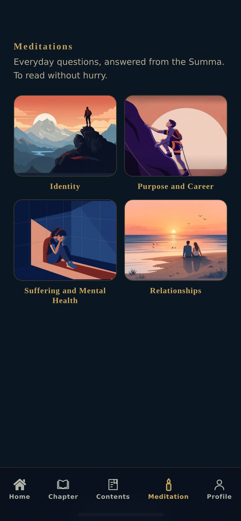
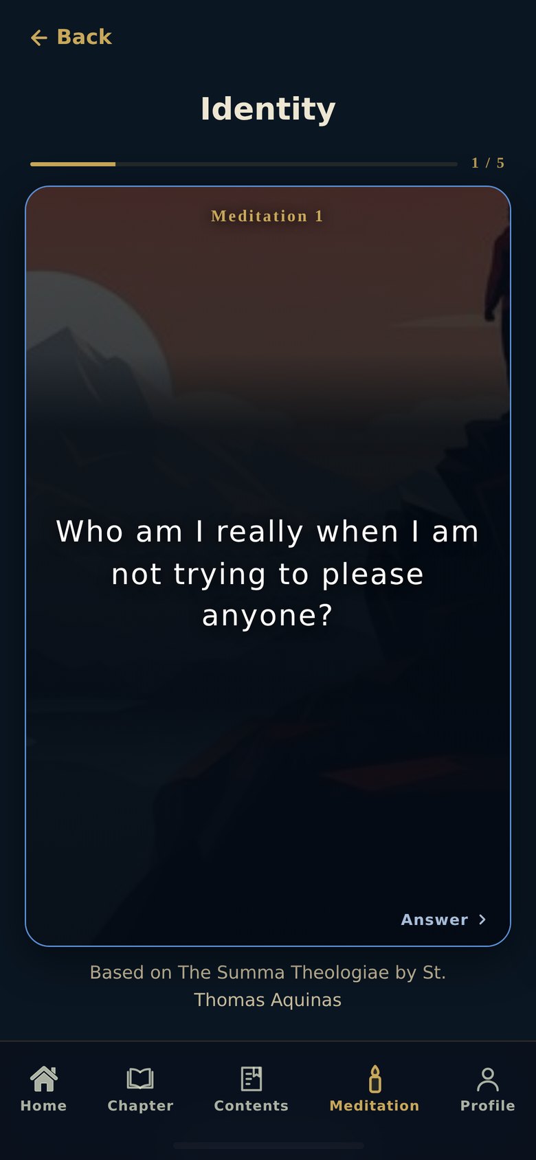
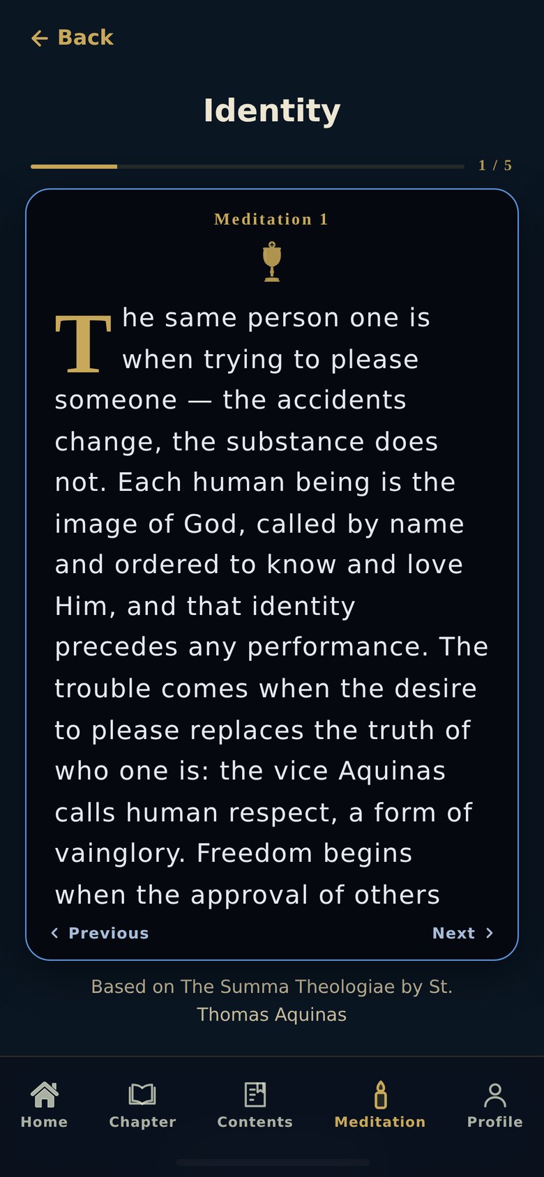
Question cards use a lapis outline with the chapter artwork behind a scrim; answer cards drop to black so the text reads clean. Swipe or tap the arrow to advance. The progress dots show how many cards are left in the set.
Three voices, each with one job.
CINZEL DECORATIVE · DISPLAY
Wordmark, chapter numerals, section labels. Roman inscriptional forms, the register of a monument, used sparingly.
EB GARAMOND · EDITORIAL
Chapter titles and pull quotes. A book face, to keep the feeling of a text rather than an interface.
NUNITO · INTERFACE AND BODY
Everything read at length, plus every control. Open counters and a tall x-height for small screens and older eyes.
The pigments of the illuminated manuscript.
Gold and lapis were the most expensive colours a mediaeval workshop could buy. Gold marks the work itself: numerals, titles, seals. Lapis marks the reader's own progress. Nothing functional is gold, which keeps the ornament from competing with the reading.
An image for every chapter.
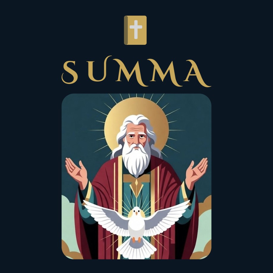
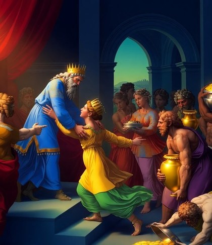
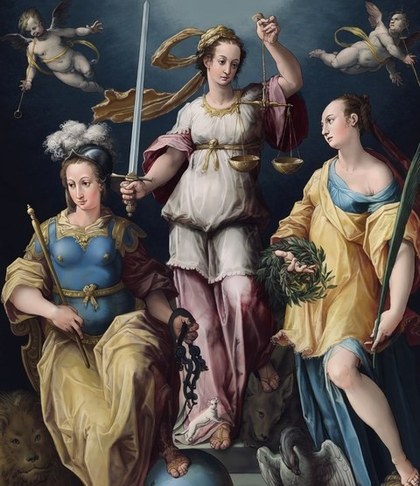
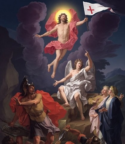
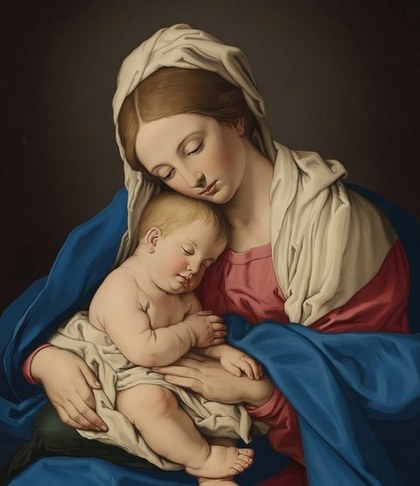
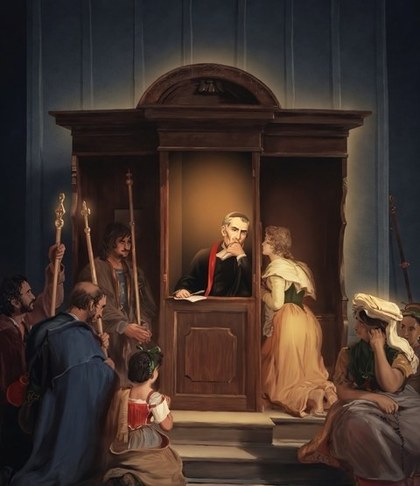
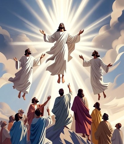
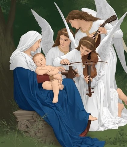
Sixty-one illustrations, one per chapter, drawing on the Christian iconographic tradition. They give a reader something to recognise before a word is read, and make a long list of abstractions feel like a place. Each is cropped to a single focal point so it survives at 64 px.





Built for the person it is actually for.
A parishioner in their seventies, on an old phone, in a poorly lit church hall. That reader set the constraints.
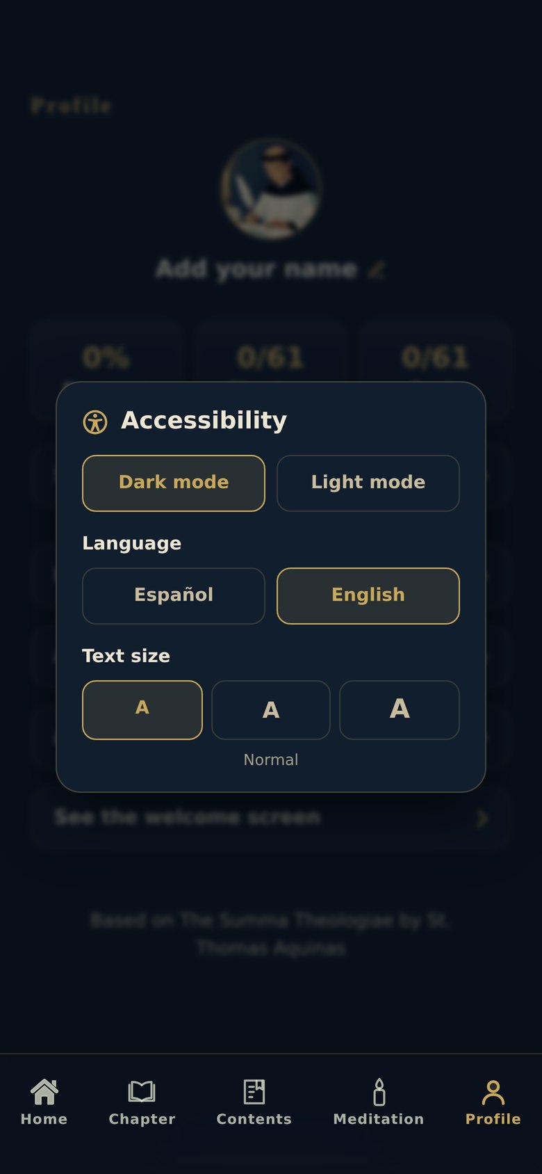
- ◆Three type sizes, applied to every screen including the cards.
- ◆Light and dark, both tested for contrast on the same artwork.
- ◆Language switched mid-chapter, without losing your place.
- ◆A tap target beside every swipe, so nothing depends on a gesture.
- ◆Audio with 10-second skips and adjustable speed.
Product, interface, illustration, audio, and the build.
A solo project end to end, with one exception: the 61 chapter illustrations were made in collaboration. I set the direction, brief and crop rules, and worked with the illustrator through each round of the 2D artwork.
PRODUCT & CONTENT
Structured 61 chapters and 781 question-and-answer pairs into ten-minute sittings, in English and Spanish.
INTERFACE & TYPE
Designed every screen, the three-face type system and the gold-and-lapis palette.
2D ILLUSTRATION, COLLABORATION
Directed 61 hand-drawn 2D illustrations and the app icon: brief, references, crop rules, and review of each round.
NARRATION & AUDIO
Produced seven hours of narration in two languages and designed the player around it: skips, speed, offline.
ACCESSIBILITY
Three type sizes, light and dark, and a tap target beside every swipe, tested on an older phone.
BUILD & SHIP
Built and shipped it as an installable web app. No account, no data collection, works offline.