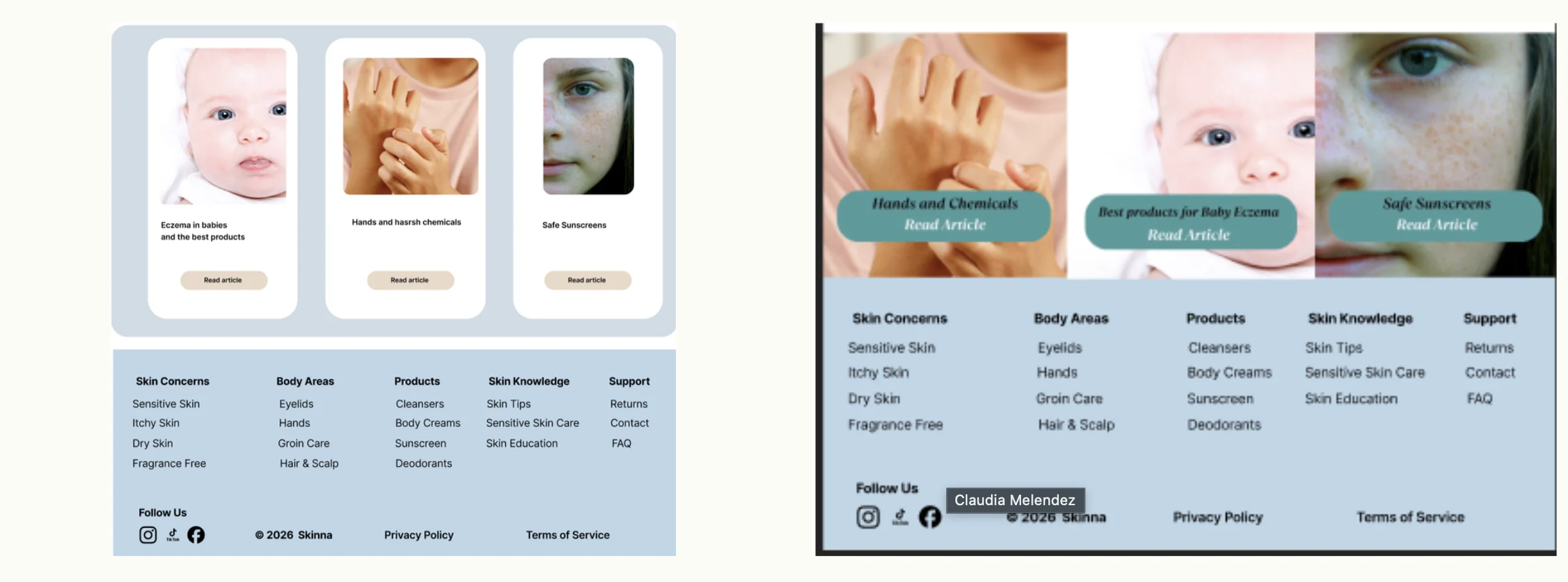
Skinna Website
A skin solution-focused online store that helps people with sensitive or problematic skin find products tailored to their condition — like eczema, itching or dryness. Its main selling point is a guided, problem-first experience (categories, filters and a skin finder tool) that recommends safe, targeted products, so users feel confident that what they choose will actually suit their skin.
Safe, effective products — found with confidence.
The goal of this website is to make it easy for people with sensitive skin to find safe, effective products tailored to their specific needs. By focusing on skin concerns and guiding users toward suitable options, the site aims to reduce confusion, build trust, and help users feel confident in choosing products that will soothe and support their skin.
Start from the skin concern, not the product type.
Clear safety features, ingredients and real customer stories.
Tags and guidance confirm a product suits their skin.
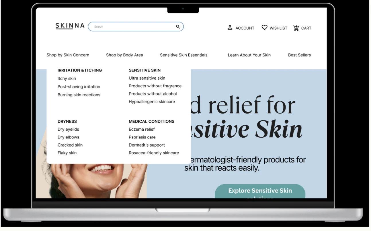
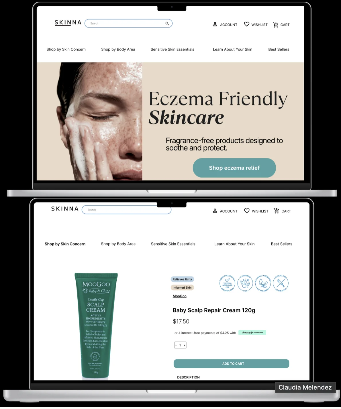
The homepage, at a glance.
Navigation by skin concern, a reassuring hero and guidance banners, all on the first screen.
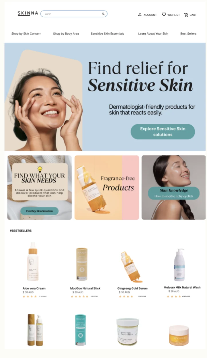
From paper to pixels.
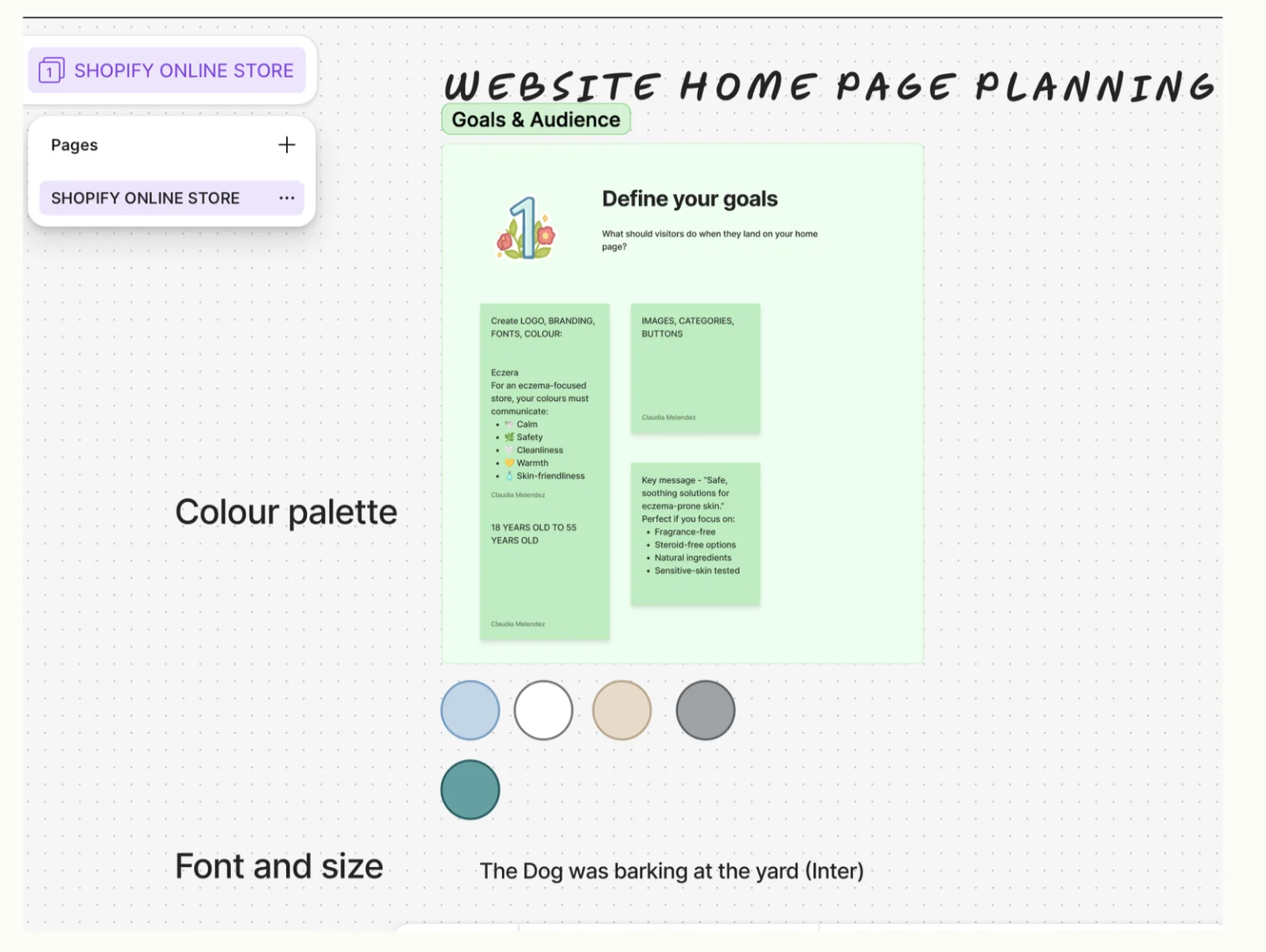
A simple layout, calming colours like sage and beige, and a gentle, reassuring brand identity reflect the company’s ethos of safety and transparency, creating a trustworthy experience that encourages confident purchasing.
Chosen to communicate calm, safety, cleanliness, warmth and skin-friendliness.
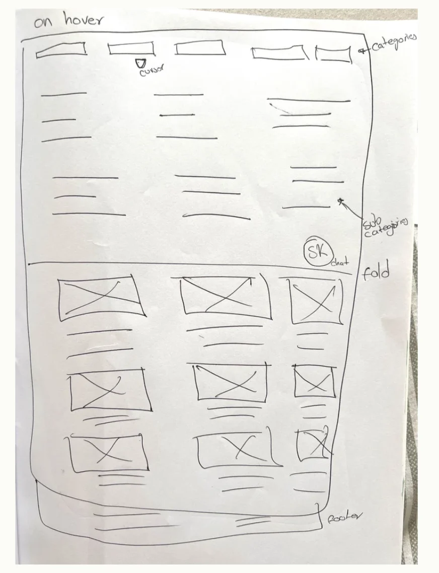
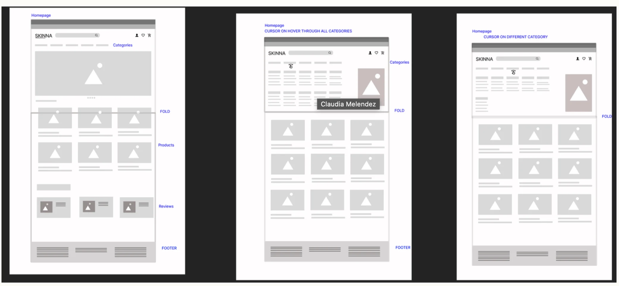
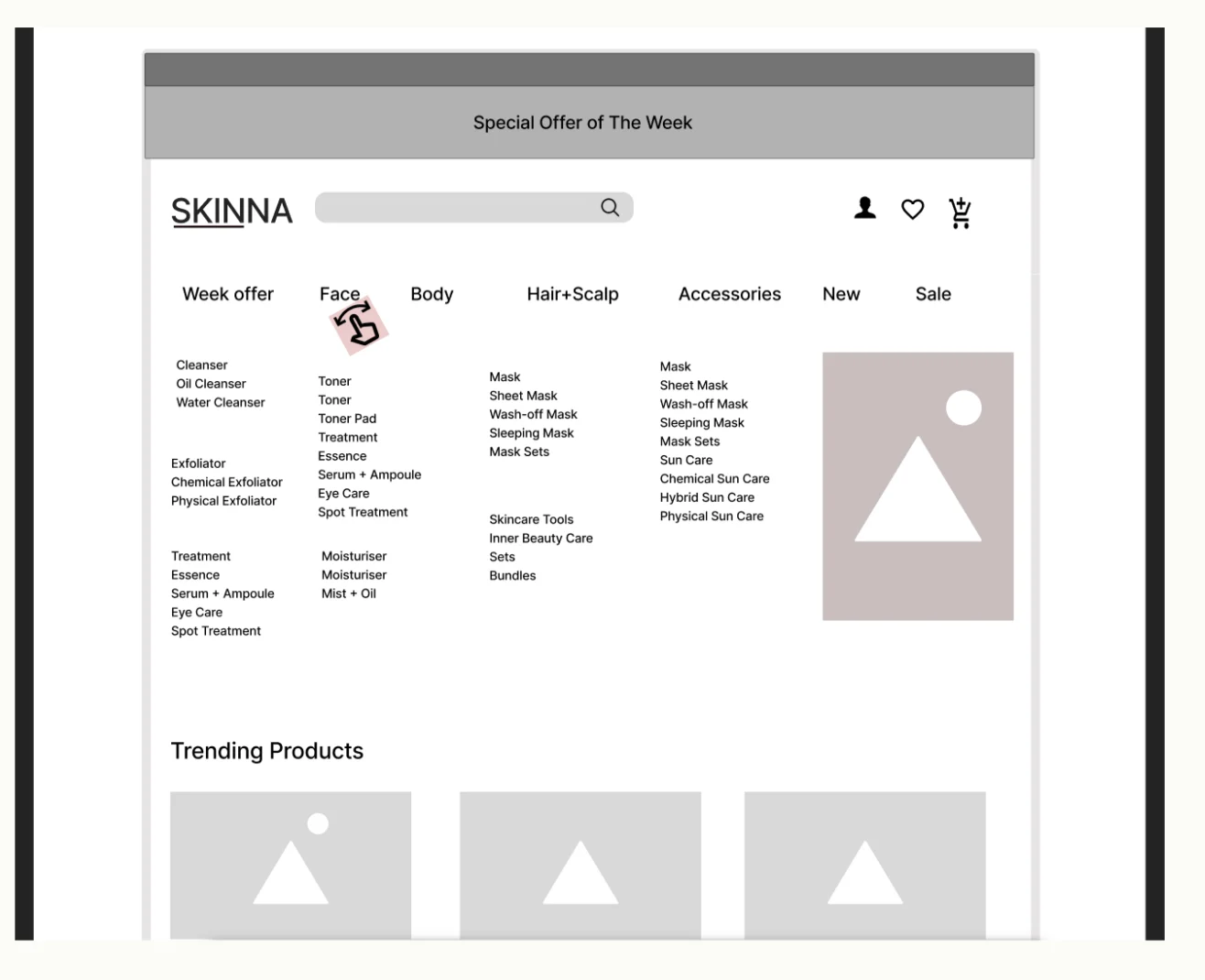
Users know their symptom, not the product.
We initially considered structuring the website around traditional product categories, as seen in most ecommerce stores. However, this approach would require users to already know which type of product they need — often not the case for people with sensitive or problematic skin.
Instead, we shifted to a problem-focused category structure, organised by skin concerns, symptoms and body areas. This guides users more intuitively toward relevant solutions, reducing confusion and decision fatigue. It also strengthens SEO, as users are more likely to search for terms like “itchy scalp” or “eczema relief” than for product types.
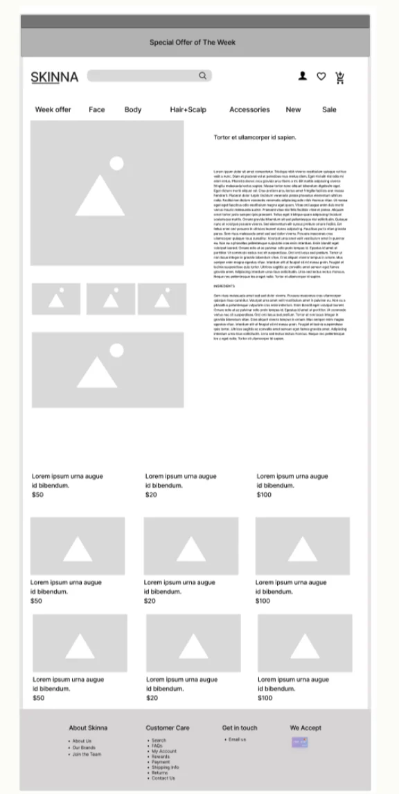
What it helps with, at a glance.
Product pages clearly communicate what each product helps with — skin concerns, key ingredients and safety features — in a simple, easy-to-scan layout, so users quickly understand whether it suits their needs.
We also considered customer stories and reviews to build trust, give real-life reassurance and help users relate to others with similar skin conditions.
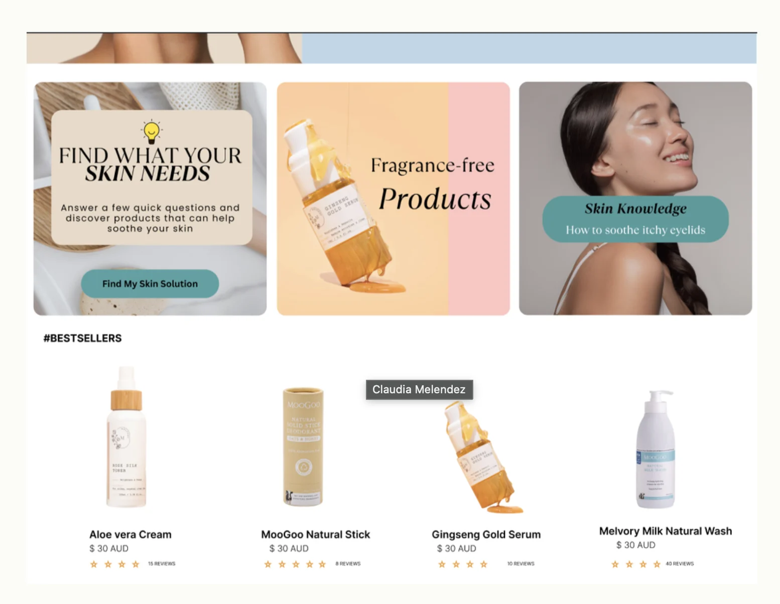
Built on trust, guided toward relief.
Banners highlight helpful information and solutions for specific skin concerns. Colourful GIFs attract attention and make the experience more engaging without overwhelming the user. Offers encourage users to share reviews and personal stories, enriching the content and strengthening credibility — providing reassurance and social proof that support confident decision-making.
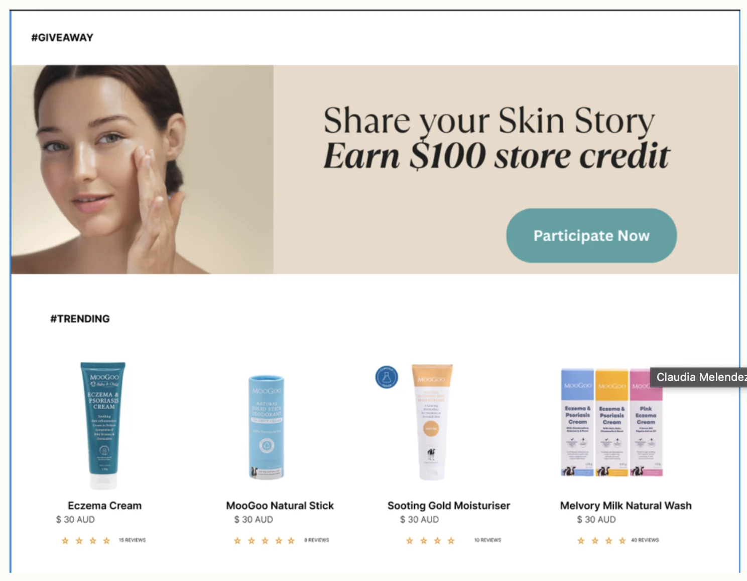
Refined with user feedback.
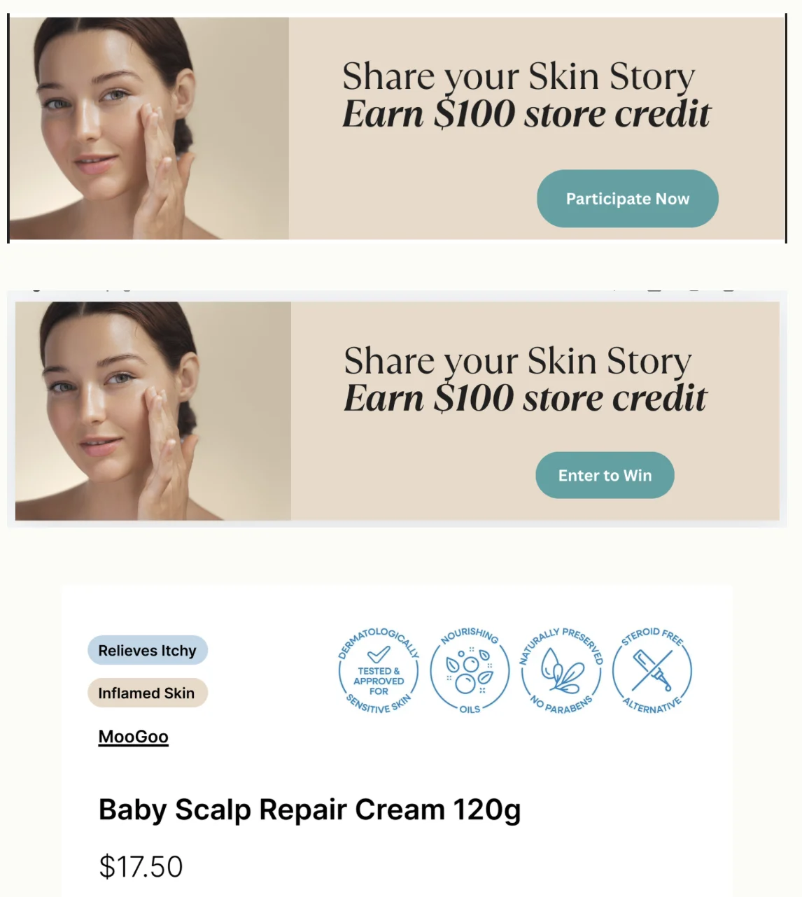
Users suggested a more attractive CTA, so “Participate Now” became “Enter to Win”.
Tags confirm what the product does, helping users make a more confident purchase decision.
Corrected for branding misalignment — the result is tidier.