Policy credibility, human attention.
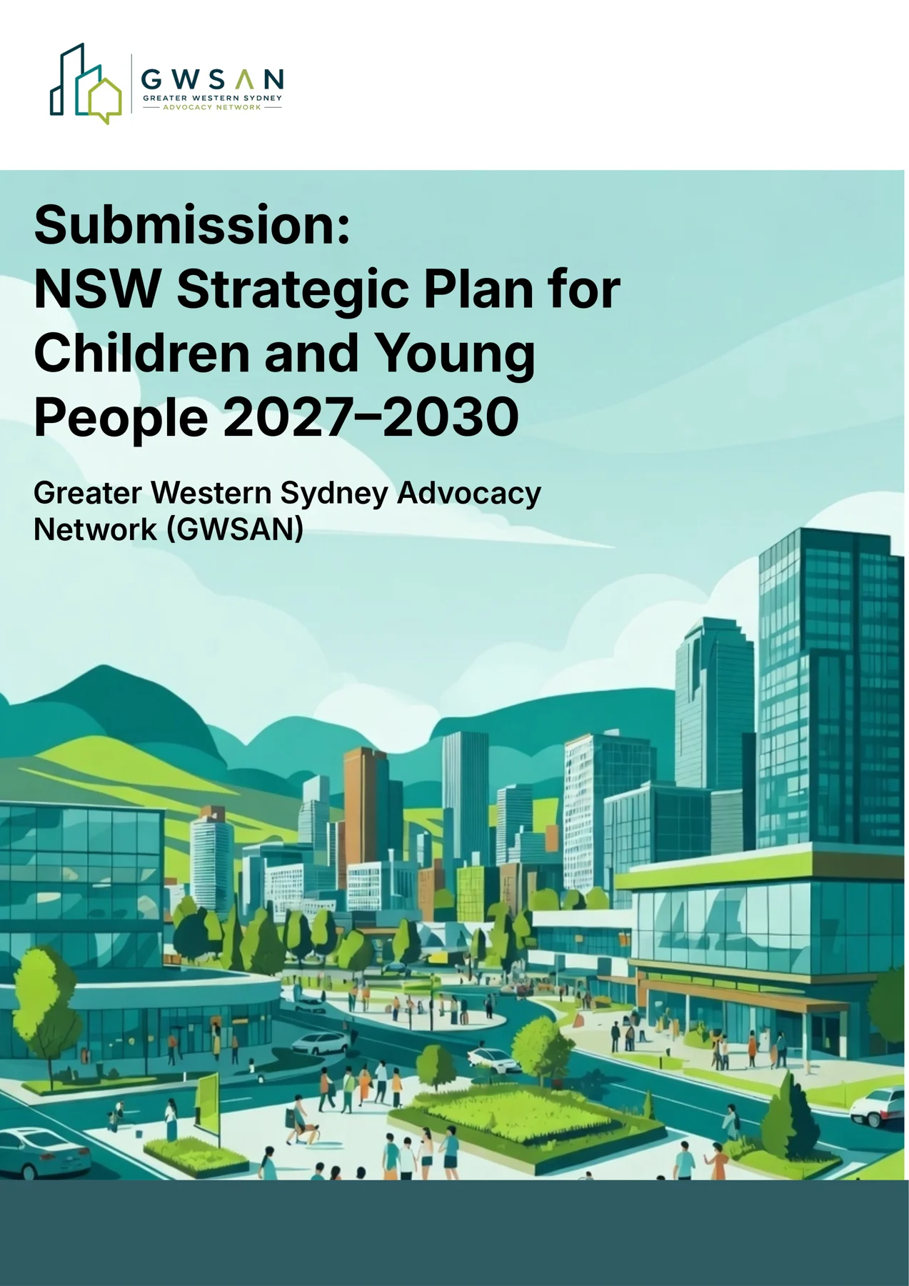
For the Greater Western Sydney Advocacy Network (GWSAN), I redesigned their official submission to the NSW Strategic Plan for Children and Young People 2027–2030.
The original document was dense and institutional in tone. My objective was to transform it into a more engaging, human-centred publication — one that would hold the attention of policymakers, stakeholders and the community while preserving its full policy credibility.
Where we started
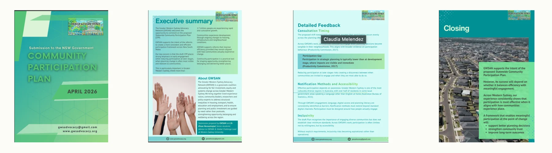
Long paragraphs with little breathing room.
Similar layouts page after page.
Hard to scan, easy to skip.
Complex issues, made accessible.
I introduced a stronger visual hierarchy with improved spacing, varied page layouts to avoid repetitive structures, and consistent application of GWSAN’s updated colour palette and branding. Vibrant illustrative imagery of Greater Western Sydney, compelling headlines, and thoughtful use of icons, statistics and callout sections brought the content to life.
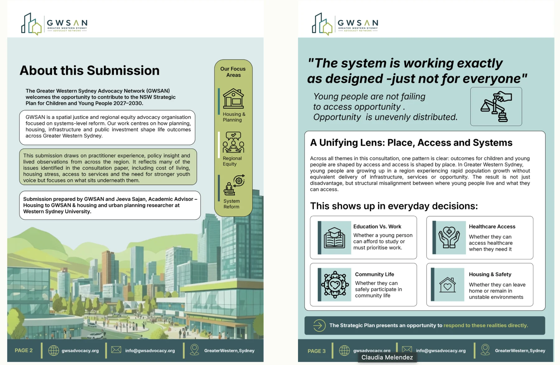
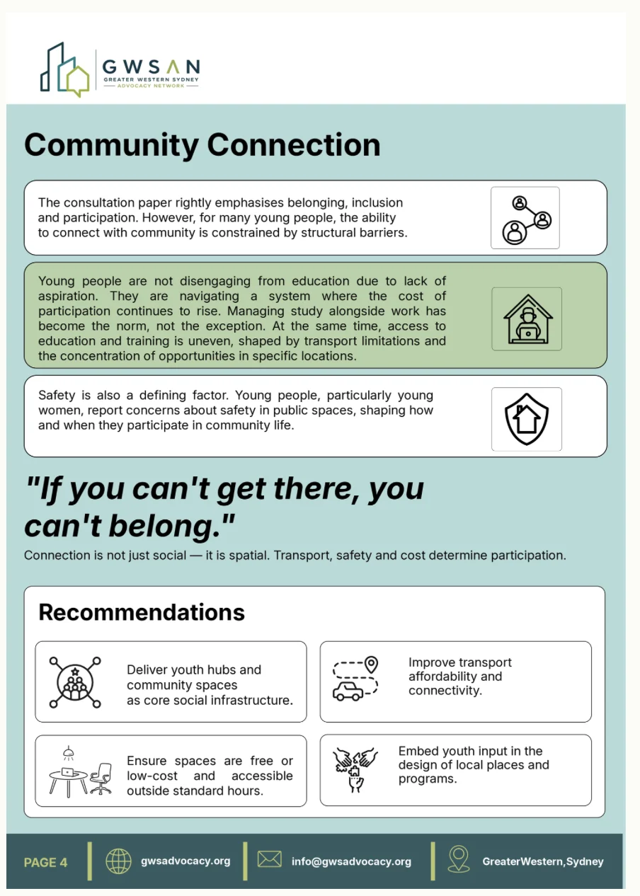
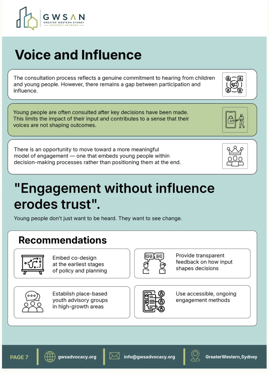
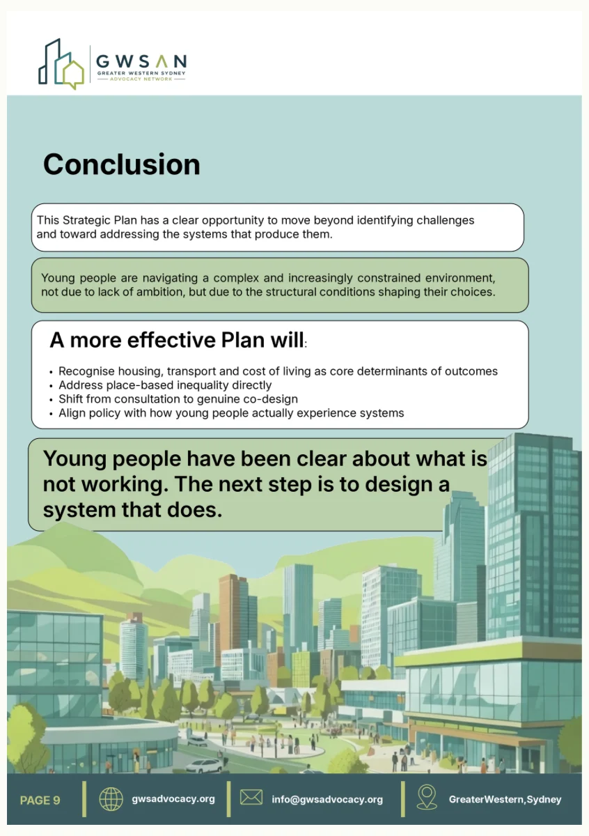
Pull quotes like this turn policy findings into lines people remember.
Drawn from the GWSAN logo, then extended into supporting tints for backgrounds and callouts.
A reusable style guide.
This project established a strong foundation for a reusable visual style across GWSAN’s future reports, submissions and advocacy materials. Next, I’ll refine it into a formal style guide that standardises these elements — so every future document is consistently impactful, community-connected and professionally polished.
A seven-slide carousel.
Photo bookends open and close the story; teal slides mark the wins, deep teal marks the gaps.